
How I Make Work Lately
From Polaroid to Painting

In the past I’ve mostly talked about other people’s work, but I wanted to switch it up and share some of my own this time.
I’m lucky enough to make art for a living, but personal work has always come and gone in waves. Sometimes I’m making a lot, really into it, and sometimes I’ll go long stretches—years even—without feeling the urge to make anything for myself.
Right now I’m in one of those good stretches. Making a lot of new work and actually excited about it.
I’ve had a bunch of people ask about my process lately, so I figured I’d break down how I’ve been making these.
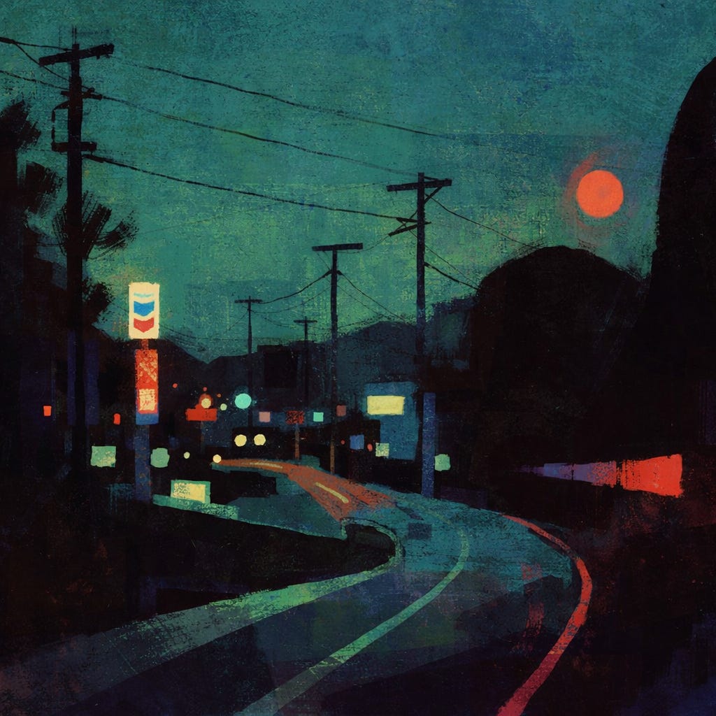
This came from a pretty simple feeling.
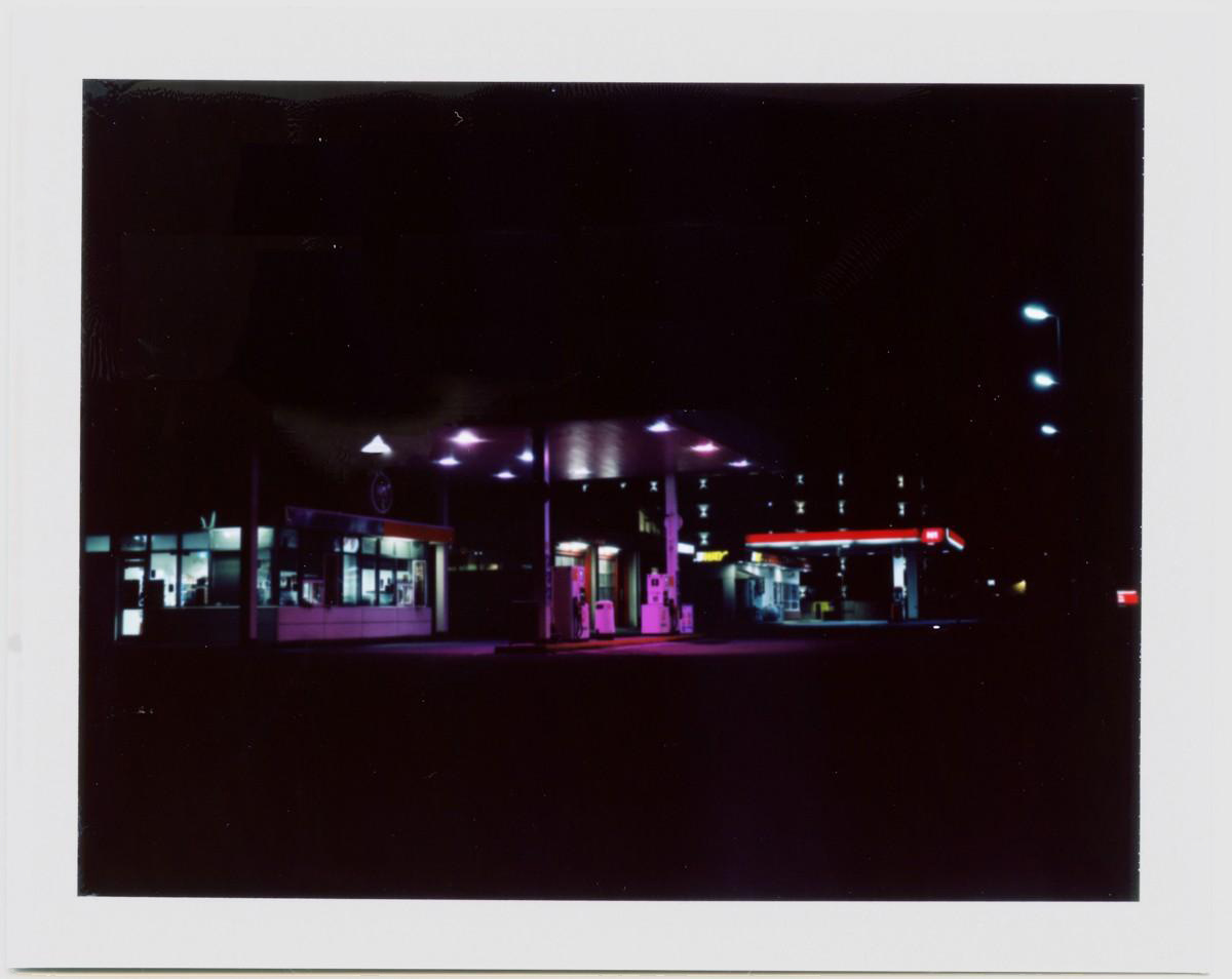
Driving out of a small town at night.
I grew up in a few small towns in So Cal—moved around a bit, but they all had the same feel. Quiet, a little spread out, and once you got to the edge of town, it just dropped off into open space.
There’s a certain feeling in that moment.
Not dramatic. Just quiet.
Like you’re leaving something behind, but it fades more than it ends.
That’s all I was thinking about here. No real story—just that feeling.
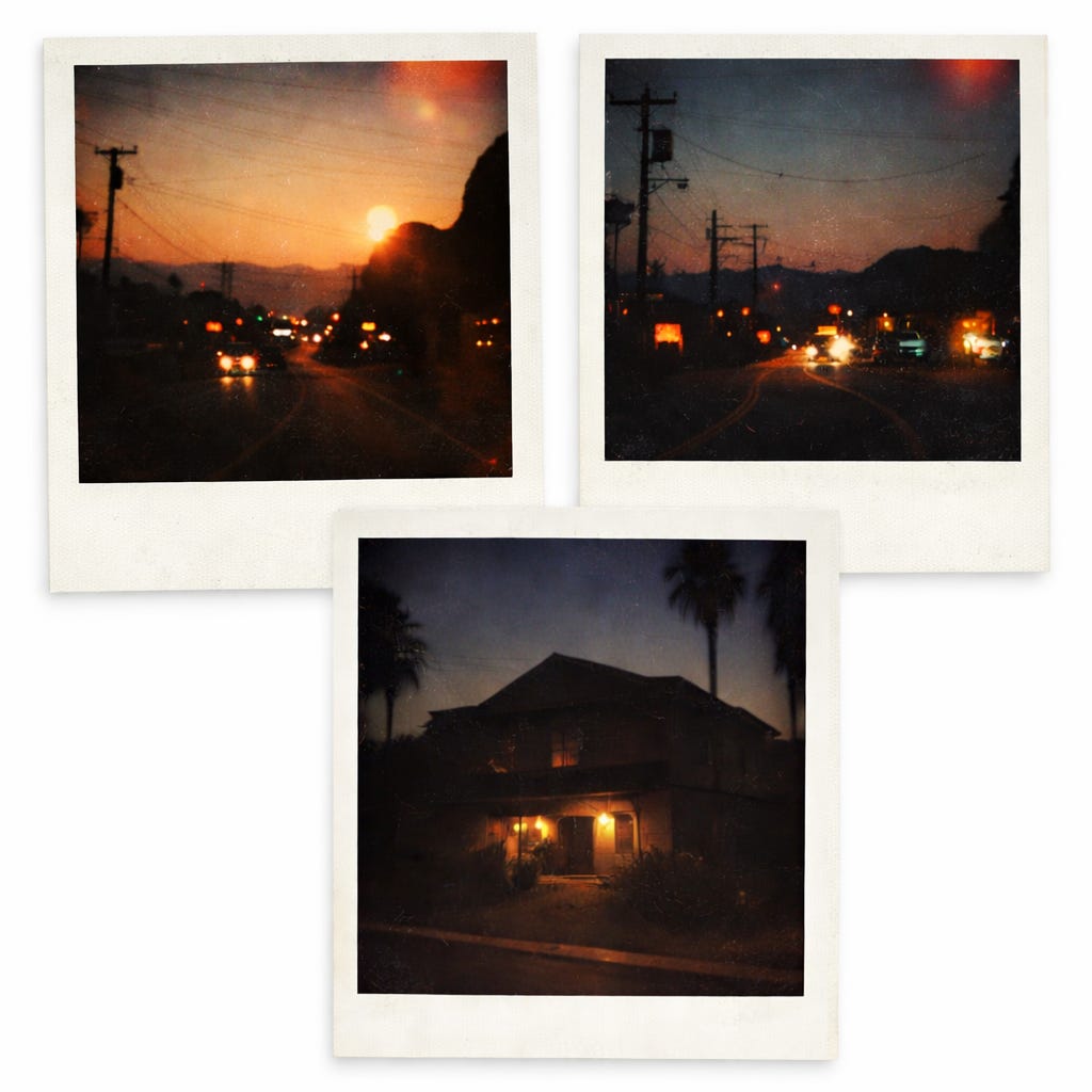
I take a lot of photos—mostly quick ones on my phone, but when I have film I’ll shoot with my Polaroid. I love how Polaroids look—the texture, the color shifts, the way the lights blow out and everything falls off into shadow.
That’s what I’m pulling from. Not exact reference—just pieces.
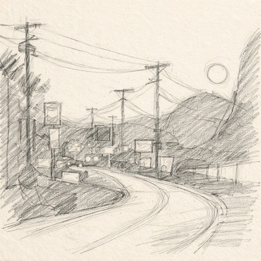
Then I’ll do a quick sketch. Just the road, big shapes, where things sit. Nothing polished.
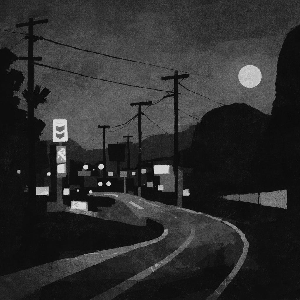
After that, a simple value pass—just dark vs light. This is where most of the image gets figured out.
At a certain point I stop looking at the photos and just go from memory.
Insight
If I stick too close to the photo, the image starts to feel dead.
The better ones come when I let go of it and just remember what it felt like.
Memory simplifies things. That’s usually what makes it work.
Color comes from the same place.
I’m really influenced by how Polaroids handle color—the weird shifts, the slightly off tones, the way colors don’t feel totally accurate but still feel right. Greens lean one way, reds get a little heavy, shadows pick up color instead of just going black.
I’m not trying to match those colors exactly though. Same as everything else, I use them as a starting point and then let go of the reference.
I’m more interested in what that color feels like than what it actually is.
For artists
Take photos, but don’t try to copy them.
Use them to get started, then put them away.
Focus on:
simple shapes
strong contrast
a few key lights
Leave things out. That’s where the feeling comes from.

I’m not really trying to paint a place exactly.
Just trying to hold onto how it felt for a second.
-Justin
What medium do you use for your colour studies? I love the decisiveness of your shapes.
Love the process!