
Radical Design
The Polish Movie Poster Revolution

When you live in Los Angeles, like I do, you’re bombarded with movie and T.V. advertising. It’s a part of life, a part of the city—just as integral as the palm trees, buildings, and freeways. It’s a city built on images.
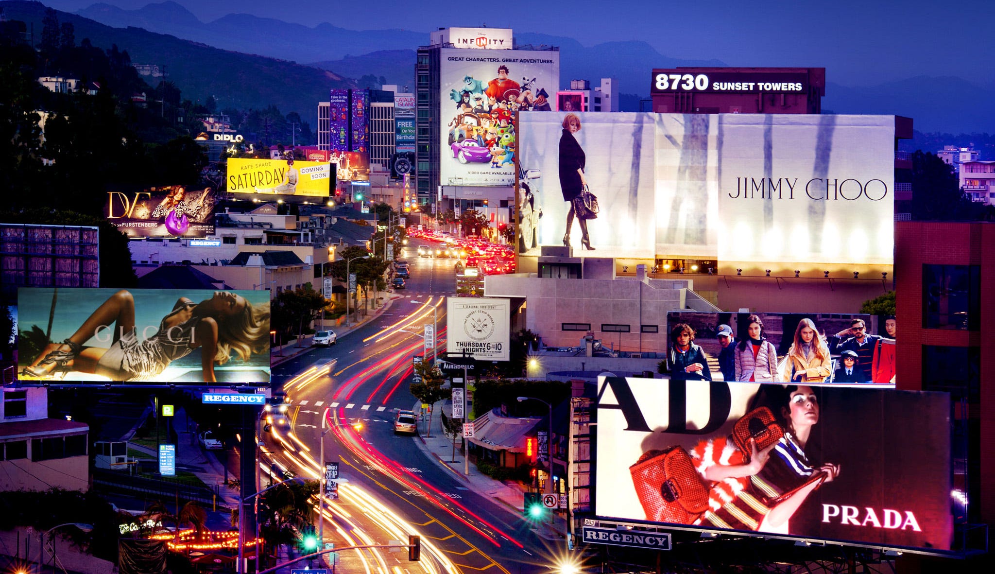
You’ve probably noticed that nowadays, nearly all movie posters look the same, and every genre seems to follow its own visual rules. Contrasting blue and orange color blocks signal an action movie. A dazzling yellow background represents a quirky indie production. There are countless other examples: a close-up of a terrified eye for horror films, a suspenseful shot of the protagonist from behind for superhero movies, or—perhaps the most obvious trend—a poster focused entirely on the movie star. In Los Angeles, actors' faces loom over busy streets, staring down from massive billboards and building-sized posters. The goal isn’t always to sell a story but to sell a face, banking on celebrity recognition over substance.
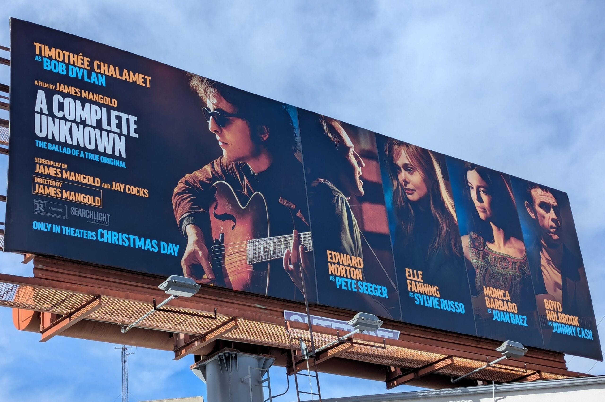
Driving down the Sunset Strip a few weeks ago—which, for non-Angelenos, is famous for its massive, colorful billboards that light up the area in a dazzling display of American glamour and pop culture—I spotted a giant poster for A Complete Unknown, the new Bob Dylan biopic starring Timothée Chalamet. The design? Just Chalamet’s face, with a few smaller photos of the supporting cast. No visual storytelling, no sense of Dylan’s impact, no hint of the film’s themes—just Chalamet’s face.
The message is clear: Like Timothée Chalamet? Great. He’s in this movie. Go see it.
Don’t get me wrong—I like Timothée Chalamet, and after the Dune films, I’ll happily watch him in anything. But that’s not the point. This modern advertising trend feels completely uninspired—marketing that reduces a film to a personality rather than an experience.
Movie posters can be so much more.
Let’s dive into a time when movie posters pushed the boundaries of art, design, and advertising. For a few decades, a movement in a communist country developed its own individual style to a new extreme—one that, even by today’s standards, feels absolutely crazy and radical. Welcome to the history of Polish movie posters.
You might have heard of great Western poster illustrators like Bob Peak, John Alvin, Richard Amsel, or Drew Struzan. Granted, every one of them is a legend in his own right, but while these artists created incredibly detailed drawings with a heavy commercial appeal, the art of Polish movie posters is an entirely different beast with a long history deeply rooted in the country's past.
Without going into too much detail about the wars and invasions, just know that Poland—and the Polish people—have endured relentless attacks from outside forces. At one point, the country was even erased from the map for a substantial period, its territory divided among Prussia, Austria, and Russia. These threats fostered a deep-seated mentality of resistance, ingrained in the Polish collective consciousness. Yet, despite these existential crises, a thriving artistic community emerged, centered in Kraków.
These painters were influenced by Jugendstil, Cubism, and Modernism. Of course, there are dozens of influential names worth mentioning, but Tadeusz Gronowski (1894–1990) stands out as the most important. He is largely credited with establishing the so-called school of Polish poster art. Thanks to his connections with the pioneering scene in Paris (where the modern poster was invented) and his innovative use of the latest tools available, he created powerful images that left a lasting impression. To this day, Poles take great pride in this particular segment of their cultural heritage.
But let's get back on track -- after WWII, Poland traded one dictator for another, falling under communist rule, and fine art was censored by the Stalinist regime. However, a surprising twist created a loophole. The state-owned film industry, represented by Film Polski and Centrala Wynajmu Filmów (CWF), hired artists to work on poster designs for movies, but they absolutely didn’t care what they would look like.
This created a unique situation and a renaissance of Gronowski’s poster school in which creatives were granted nearly unlimited artistic freedom to do whatever they wanted, without any interference from the government or big Hollywood studios. By the 50’s movie poster design had de facto become the only form of unregulated artistic expression and became a starting point for at least three generations of artists who switched from fine arts to graphic design.
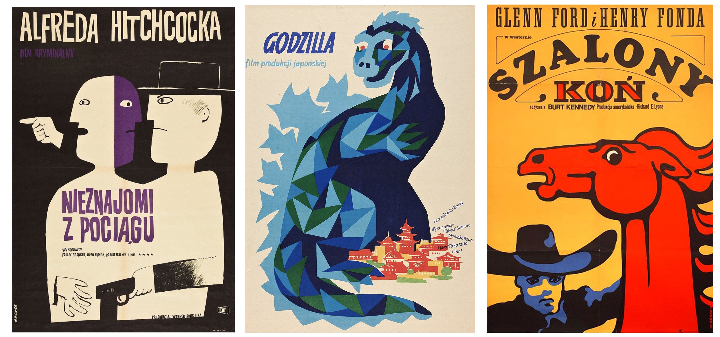
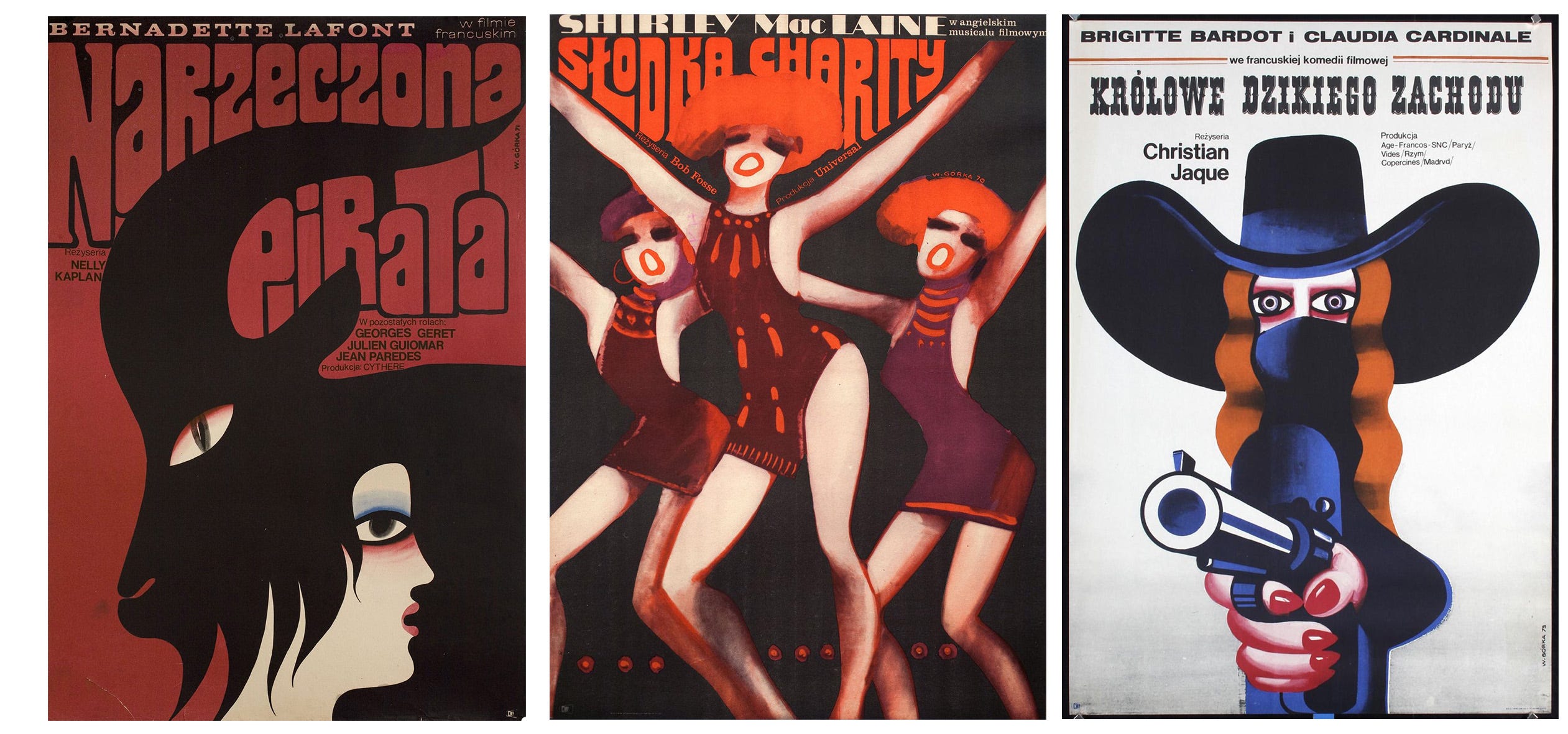
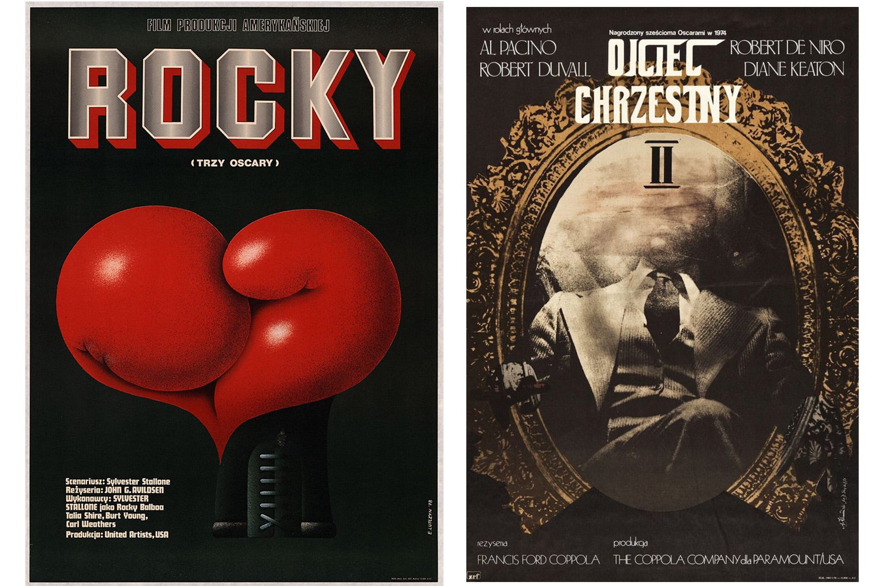
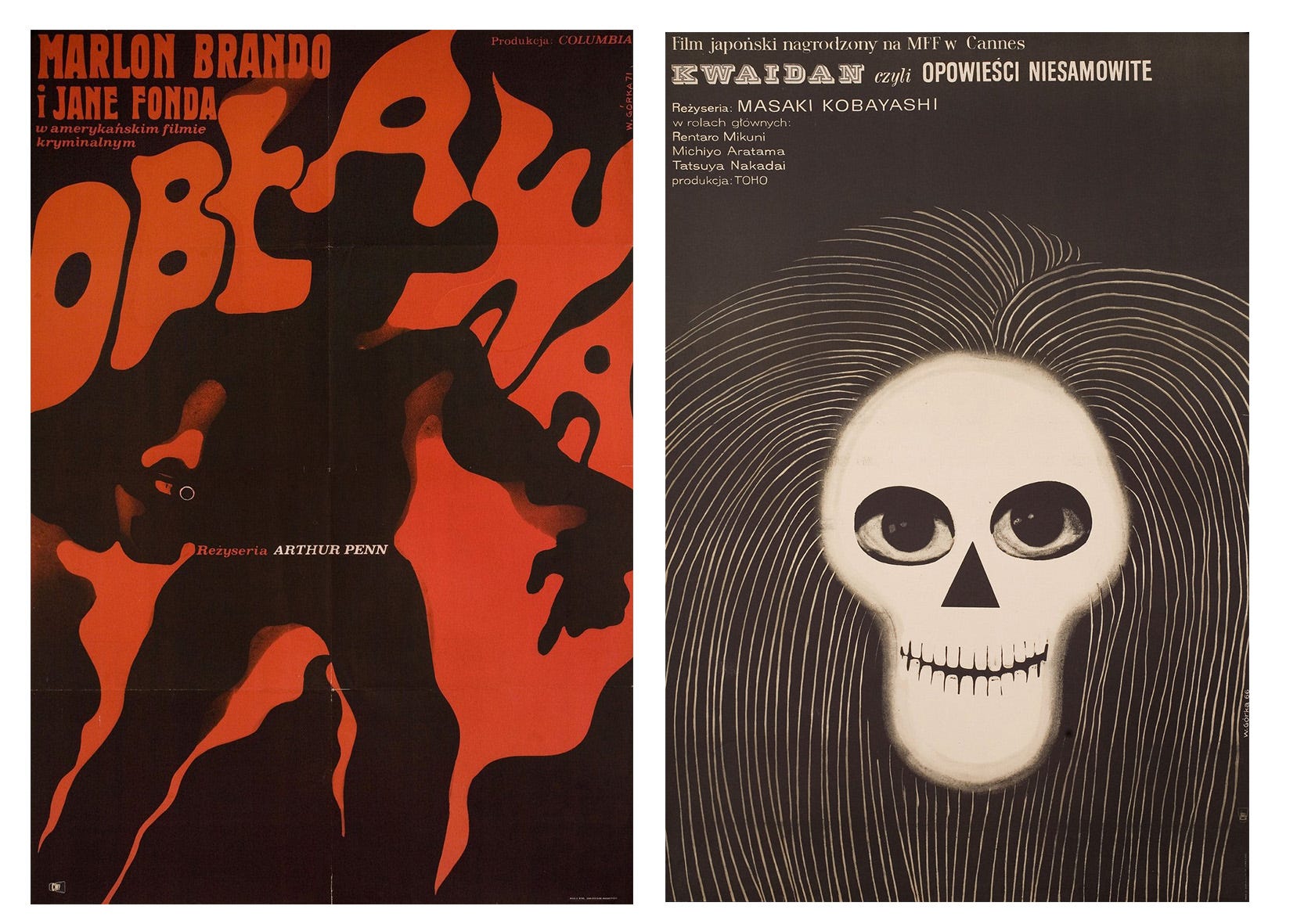
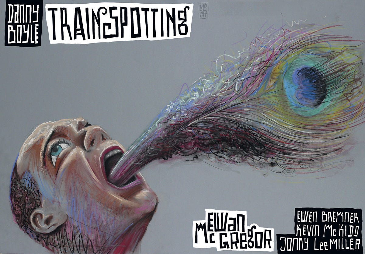
Without any commercial constraints the resulting images were absolutely wild interpretations and a far cry from the western originals. No headshots of the starring cast, no pictures of an impressive scenery and no fancy title design. Instead the artists got creative and found clever ways to represent the themes and movie titles in a symbolic and more abstract way using striking colors, eccentric visuals and witty metaphors.
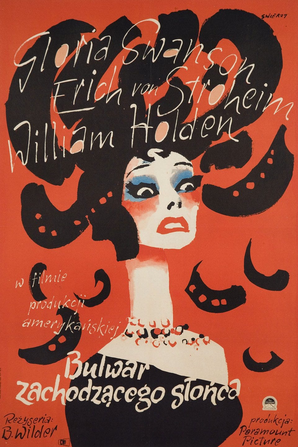
Waldemar Świerzy’s Sunset Blvd, created in 1957 is a great example of the polish school of poster design. It’s a striking reinterpretation of Hollywood noir, dripping with psychological intensity. Gloria Swanson’s face dissolves into bold, chaotic brushstrokes, symbolizing Norma Desmond’s fractured psyche and fading stardom. Świerzy’s expressive, almost surreal approach elevates it beyond mere promotion—it’s a haunting work of art.
The Polish style gave the artworks an almost universal quality, especially when you realize how many are charged with morbid and sexual overtones. Headlines, billing lists and other text elements were also often written by hand and directly incorporated into the design.
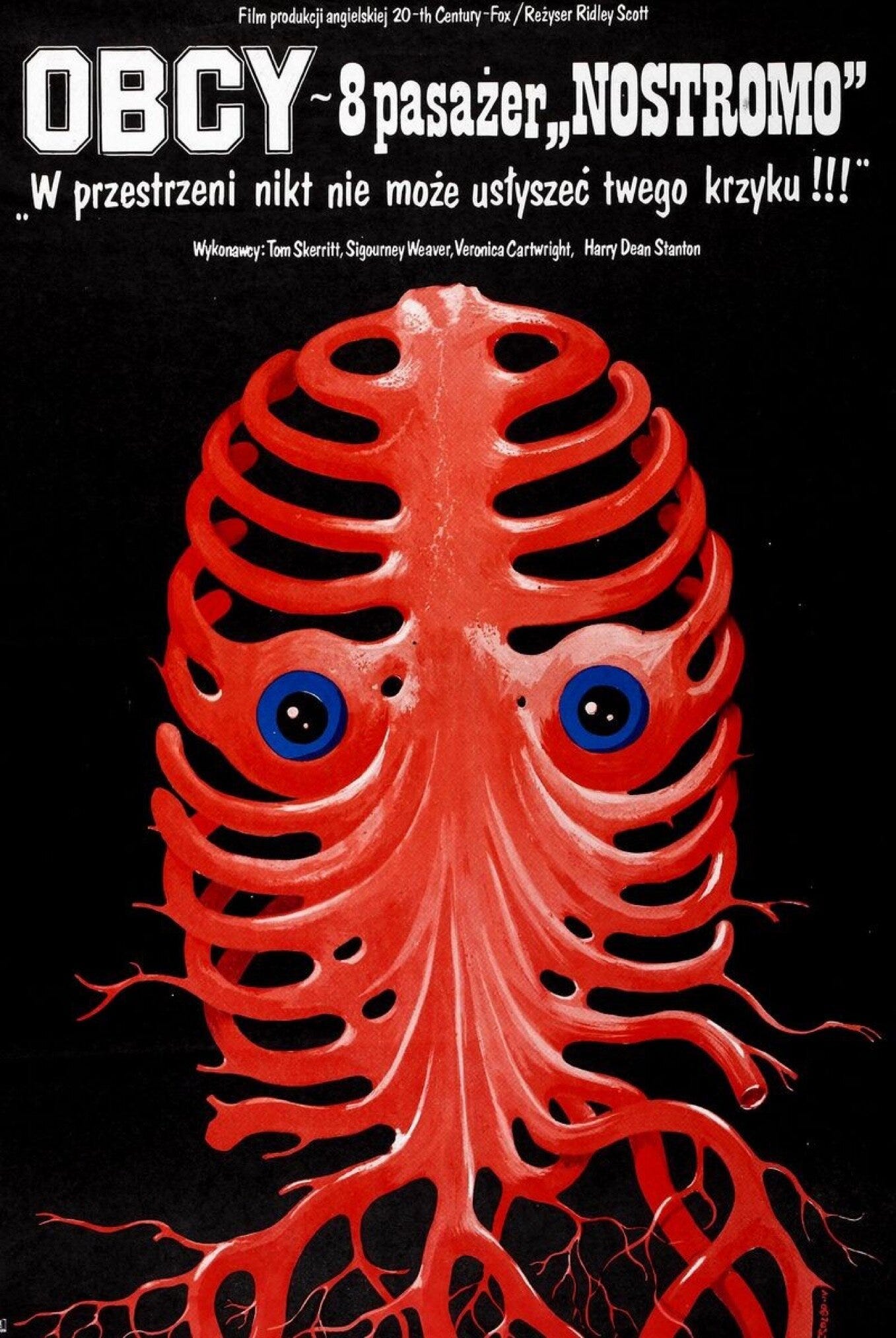
Take the poster for Alien, for example. These visuals have absolutely nothing in common with anything represented in the movie, begging the question if the artists were even allowed to see the movies beforehand?
Also, the alternative versions of Raiders of the Lost Ark has an extremely bizarre feel, more reminiscent of a horror movie than an adventure flick.
Since the posters of that period were driven solely by the creators’ imagination and lacked a unified style or manifesto, they cannot be classified as a distinct artistic genre. Instead, they represent an exceptional phenomenon influenced by various movements, including Expressionism, Surrealism, and Dada.
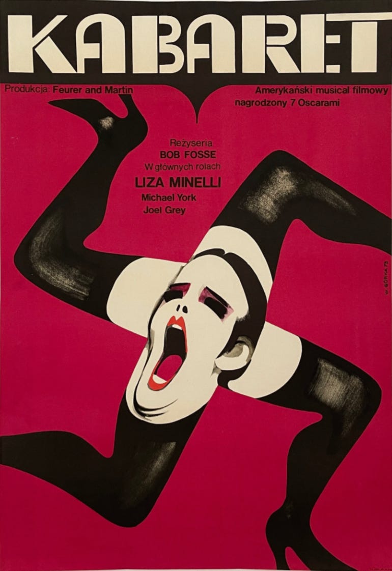
The 1950s through the 1970s marked the golden era of Polish movie posters. In 1973, designer Wiktor Górka created one of the most iconic Polish posters for the film Cabaret. His work is a masterclass in bold, provocative design, using a clever visual metaphor to capture the film’s decadence, sexuality, and underlying political tension.
Unfortunately, due to several factors—mainly the advancement of computer technology and Poland gaining independence from the USSR, which ultimately dissolved in 1991—this method of producing promotional material quickly became obsolete.
Starting in the 1990s, movie posters began to look the same as those anywhere else, and physical movie releases from that period were updated with versions closer to the original artwork. However, due to popular demand, special editions with alternative designs are still occasionally commissioned to keep the old tradition alive, and collectors are willing to pay exorbitant prices for both original posters and reprints.
Thanks to emerging posts on social media and blogs, awareness of this brief but impactful experimental design phase is spreading.
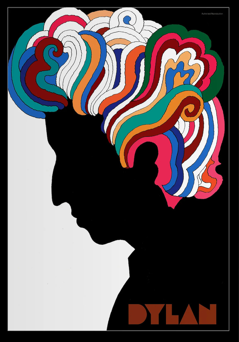
Let’s get back to the Sunset Strip and that giant billboard for A Complete Unknown, starring Timothée Chalamet. Seeing it, I couldn’t help but think of Milton Glaser’s iconic Dylan poster—the one with the stark black silhouette and swirling, kaleidoscopic hair. Even if you’re not a Bob Dylan fan, you’ve seen it—it’s part of the iconography of rock ’n’ roll, the 1960s, and America. That image captures something ineffable about Dylan’s spirit—his creativity, his mystique, his cultural weight. It doesn’t just remind you that Dylan exists; it makes you want to listen to him. It engages you, pulls you in, and makes you curious.
That’s what a great poster should do—it should create something complex, striking, and original that becomes as much a part of the film’s identity as the film itself. It should be emotional, beautiful, memorable, and even mystifying—sparking curiosity and encouraging you to engage with it.
Posters can be more, so much more, and for a few decades in Poland, they were.
These are incredible! Thanks for sharing such rich history
Thank you for writing this post. Easter European graphic design is truly wonderful!